The Hough Transform is a method for extracting features from an image, such as lines, circles, or ellipses. For example, the computer vision task of edge detection can identify edges, but doesn’t describe the properties of those edges, such as whether or not the edges form a line or if those lines converge on a vanishing point. The Hough Transform is typically used for tasks like lane detection in autonomous driving, but the same process can be applied to architectural drawings or photography to shed some light on the properties of the lines in those images.
These transformations are really fun to generate, and I’m hoping they can be useful for classifying drawings by their perspective. For example, I would like to be able to classify a dataset of architectural drawings into plans, perspectives, isometrics, etc., and this type of analysis may be necessary for getting a machine learning process to “understand” the nature of the linework in a drawing. This is also a prerequisite for using ML to synthesize realistic architectural drawings, which is my eventual goal.
An oversimplification of how the transformation works: A drawing or photograph is processed with Canny edge detection. This extracts the high-contrast edges in an image. These edges are rendered as individual points, or pixels, not as true vectors or lines. Each point of the edge is converted from (x, y) coordinates to a series of (r, θ) coordinates, where r describes the distance from the center of the image to the nearest point on a line, and θ describes the angle of that line. The result is that every point on the edge is represented as a sinusoidal curve on a Hough Transform matrix. When these sine curves converge at a single point, it indicates that they describe a straight line.
This demo helps for building an intuition for the process. To put it simply, it’s a matter of representing points as lines, and lines as points.
Original drawing, Canny edge detection, and the Hough Transform matrix.
Radial drawings produce a distinct band of curves. A perfect circle produces a perfect sine curve band, with hard edges. The middle point of the circle is indicated by the curve along the middle of the band.
Isometric drawings produce one or two vertical bands on the HT matrix, where the sine curves converge. The “x-axis” on the HT matrix is now the “theta” axis after the transformation, indicating the slope of each line, so isometric drawings will produce a vertical band on the left and right of center because of all of the parallel lines at about 45 degrees and -45 degrees. Notice the vertical bands on the last drawing are not perfectly vertical because the drawing is not a true isometric, but a 2 point perspective.
These gridded, orthogonal drawings have a distinct vertical band at the center of the “x-axis”. This falls at the theta=0 point, meaning the lines are horizontal. In the first drawing, which has no horizontal lines, the central vertical band isn’t showing converging points, but a lack of lines at intervals.
One point perspective drawings are difficult to characterize by their HT matrix. Lines that converge upon a single vanishing point appear as an implied sine curve in HT space. I say implied, because there’s a lot of linework that adds noise to the curve, and often the perspective lines don’t actually extend all the way to the vanishing point.
Borders are common on architectural drawings, and they show up as little flares in the HT space. See the convergences on the center line, above and below most of the linework. These indicate horizontal page borders at the top or bottom of the drawing.
Here are some pure grids and their HT counterparts. The orthogonal grid has a vertical band of converging lines at the center (horizontal lines), and converging lines at the edge of the matrix (vertical lines). The isometric grid, in which Canny edge detection only picked up the nodes, has a few different vertical bands, indicating the multiple angles at which the nodes on the grid align.
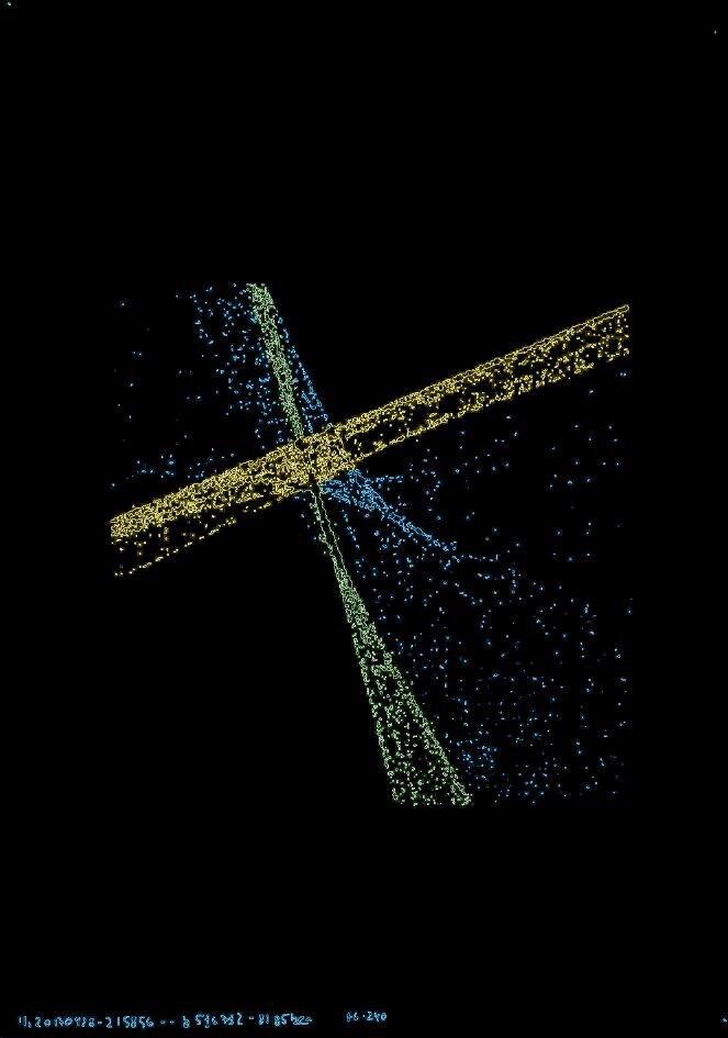
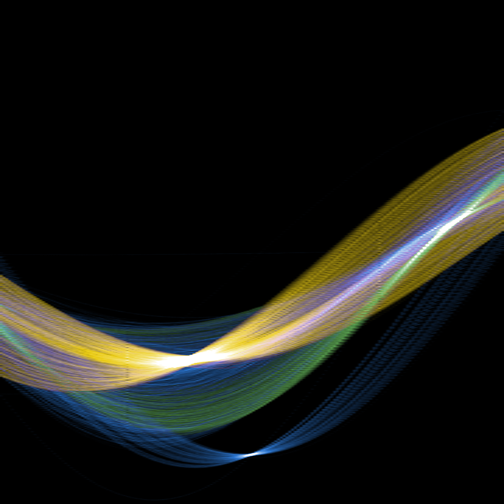
This is a color-coded drawing, with the HT bands colored respectively. The yellow band has a bright convergence slightly left of center (from a slightly positive slope of yellow lines in the drawing), and the green band has a convergence on the right which describes its slope. Notice the blue line, converging at the center (theta=0) point of the matrix, which came from the horizontal line of text at the bottom of the drawing.
Here are some interesting honorable mentions.
The Hough Transform was done with this Google Colab Notebook by Yoni Chechik, with a few modifications.
I use Derrick Schultz’s dataset tools to do Canny edge detection.
The coloring of the HT matrices were done with a gradient filter in Photoshop.


