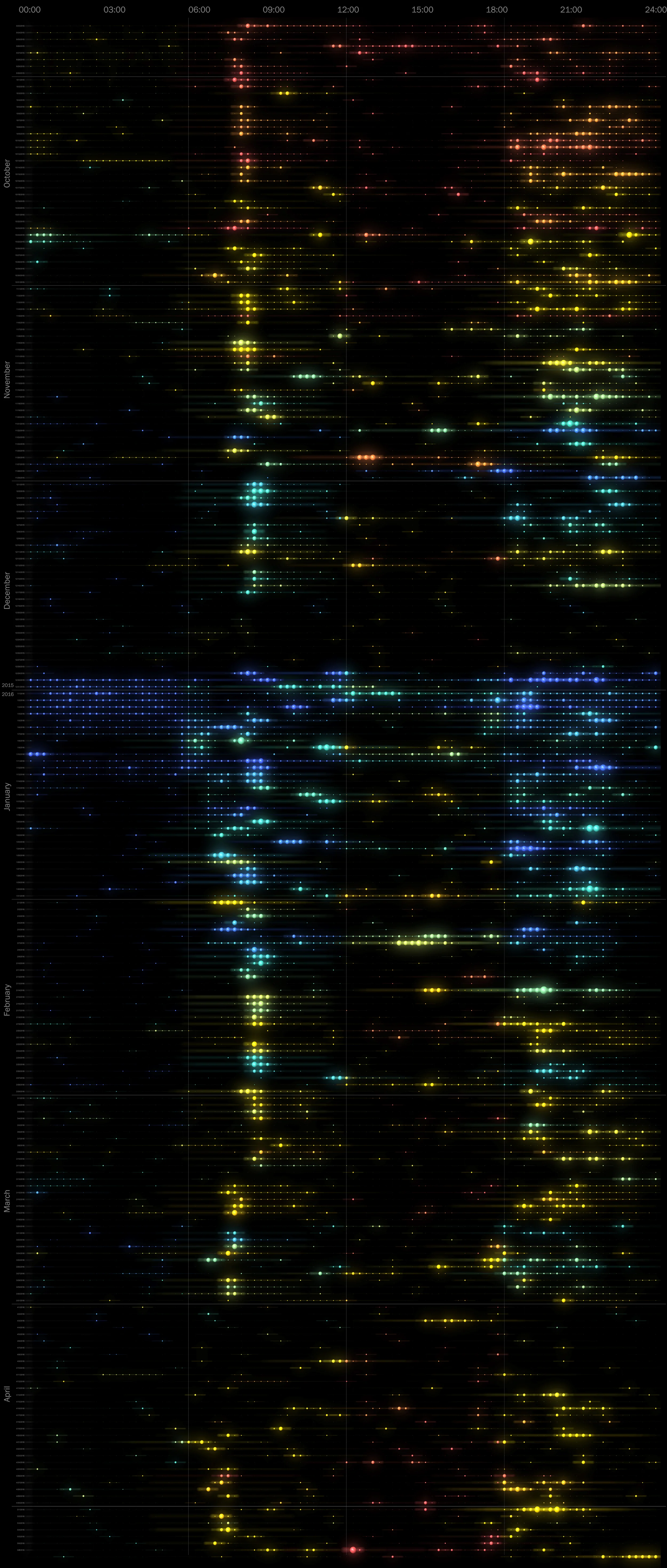
Detailed home energy data is becoming more accessible with energy providers like CPS and PG&E replacing their electric meters with smart meters that log hourly data. If you have hourly energy data and feel the urge to make a shiny rainbow calendar from it, here's how to make one with Grasshopper for Rhino. This is seven months of my apartment energy use, with an energy dot every 15 minutes. The radius of each dot is relative to my total energy use at that time. The maximum value was about 1.8 kWh. The dot color represents the outside temperature, <40 degrees in blue, and >85 in red.
This is similar to an energy use graphic by Michael VanDaniker, but this simplifies the weather data from Weather Underground so you don't need to know how to use their API.

The Grasshopper script, available for download here, takes a spreadsheet of energy data and a spreadsheet of weather data and plots out the energy dots in 3D.
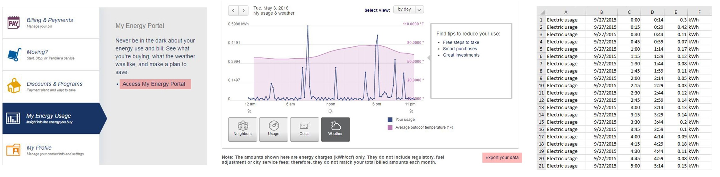
If you have a smart meter installed by CPS, login to your dashboard, select My Energy Use > Access My Energy Portal, then Select view: by day. Select 'Export your data' and 'Export usage for a range of days'. Open your .csv Excel file and delete all the title rows so your first line of data is in Row 1 like the image above.
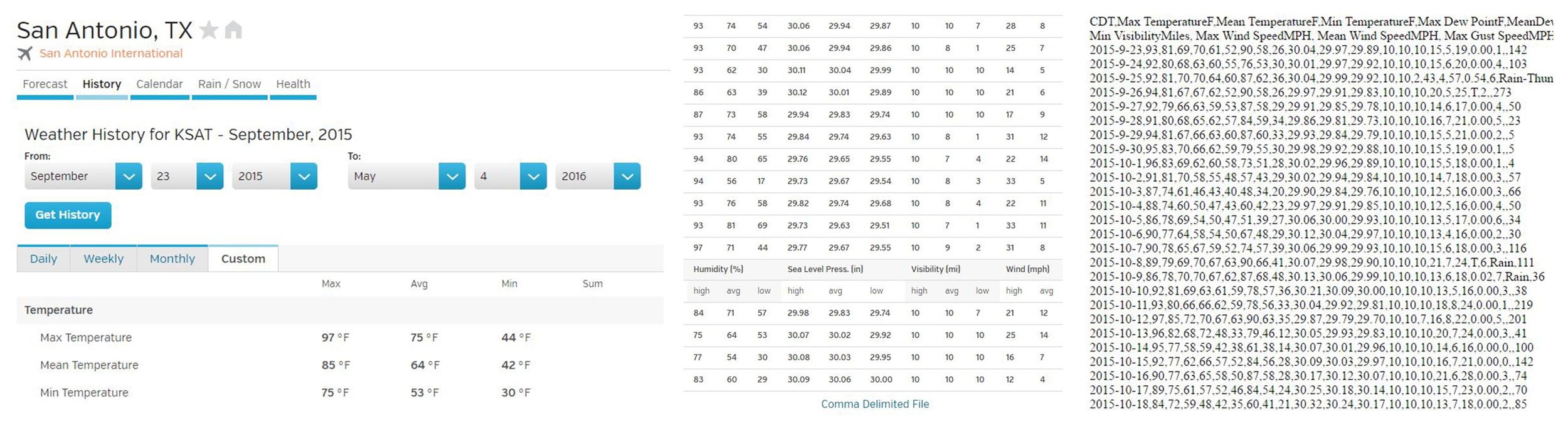
Weather Underground has daily historical data available for download. Go to your city, select History > Custom, select the same date range as before, and scroll all the way to the bottom and select 'Comma Delimited File' to get hourly weather data as text. Copy and paste everything into Excel.

When your data is copied into Excel, make sure your data in column A is highlighted, select Data > Text to Columns > Delimited > Next > Check Tab and Comma > Next > Finish. Now your data should be separated into columns like the image on the right. Save your two spreadsheets as .csv or Comma Delimited files.
Now you're ready to import into Grasshopper!
The calendar view at the top is from the Top viewport in Rhino. Set the background to black by going to Tools > Options > Appearance > Color. Then export a hi-res image from Rhino by hitting Ctrl: P and selecting 'Image File' as the destination. Remember to check the 'Background Color' box under the Visibility tab.
After I export the image, I put it into Photoshop and add some Gaussian blur and Motion blur to smooth it out (Filter > Blur > Motion Blur, then set the right angle). Duplicate the original layer and set every duplicate layer to the 'Lighten' blending mode so they can be overlaid.

From the Front viewport in Rhino, we get a view of each day overlaid on top of the next. Dots are vertically offset and colored based on outside temperature. If you have even more detailed data from individual circuits, you can set the vertical offset to represent another variable like HVAC energy and get a nice energy profile of your building.

And the Perspective View is just for fun.
